Quicklinks:
Open Source demonstration web maps (using Mapbox, JQueryUI):
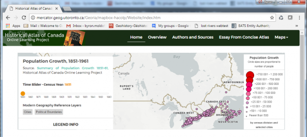
HACOLP Population Growth, Density, Distribution – by Census Division 1851-1961
http://mercator.geog.utoronto.ca/georia/mapbox-hacolp
ArcGIS Online demonstration web maps:
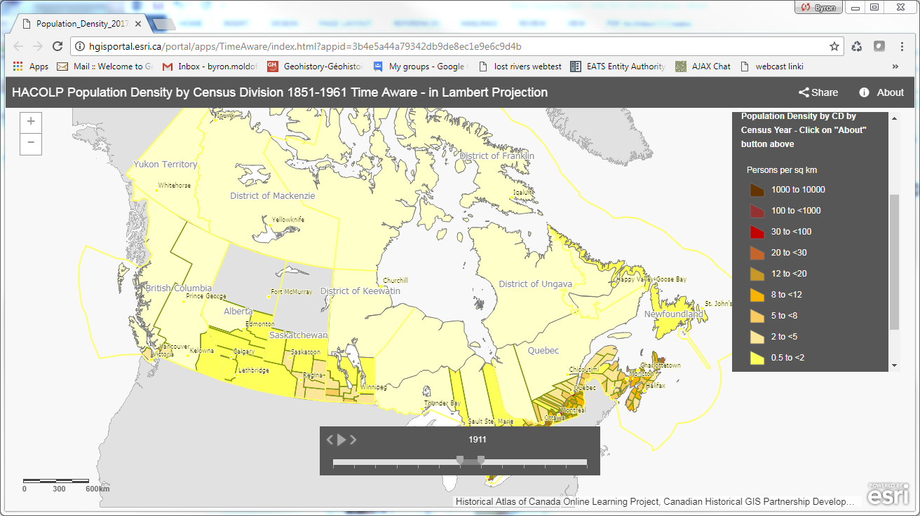
HACOLP Population Density by Census Division 1851-1961 Time Aware Apps (3 versions)
HACOLP Population Growth by Census Division 1851-1961 Time Aware App
http://hgisportal.esri.ca/portal/apps/MapAndAppGallery/index.html?appid=f7e6329dd6b3494b9b689e1750cf6781
For detailed pilot project development documents see links at end of this article.
The Historical Atlas of Canada was a three-volume collaborative research and publishing project, finished in 1993, which used maps, text and other graphic displays to explore themes in the history of Canada. A selection of the Atlas thematic “plates” was published online in 2008, using Esri’s ArcIMS technology, as the Historical Atlas of Canada Online Learning Project (HACOLP.) For more general information about that project see: http://www.historicalatlas.ca/website/hacolp/about.htm
One of the major themes explored in the Atlas was the sweeping population changes across the country through the century prior to the Atlas’ end-date of 1961. A number of demographic measures were used for different maps, periods and sub-regions, but when the HACOLP was put together, it was decided to create a chapter called Summary of Population Growth, 1851-1961, which would allow users to look at how change occurred over this whole period, contrasting three different cartographic representations.
The original website featured three interactive maps of population by Census Division, using three different symbolization methods: Population Density (choropleth), Population Growth (graduated circles) and Population Distribution (dot density) – for eleven Canadian census years, 1851 through 1961. These maps used the ArcIMS technology, and a customized Javascript legend using checkboxes to turn each year on or off.
The goal of this pilot project was to create new web maps to rejuvenate and improve the original maps, in performance and visualization. Using data provided by HACOLP, these maps have been reproduced for this pilot project while being updated to current web-mapping standards, and implementing a Time-slider tool to click through the census periods, replacing the original checkbox interface. We also envisaged this project as an appropriate one to use to explore the web-mapping software’s capacity for legend design flexibility, and for map projections other than the standard Web Mercator.
As planned for this project, we designed and produced two different versions for each of these map themes: one using the ArcGIS Online platform and another using Open Source software and web serving tools, in this case primarily the Mapbox and JQueryUI javascript libraries.
The ArcGIS ONLINE VERSIONS can be found on the Geohistory-Géohistoire Canada Development Portal (technically an ArcGIS Enterprise portal) hosted online by our partners at Esri Canada, at: HACOLP Population Apps Gallery. To view other Portal content go to: http://hgisportal.esri.ca/portal/home. The “Gallery” contains 4 apps: one for Population Growth (graduated circles), and three versions of Population Density (choropleth) – one in Web Mercator, another in Lambert Conic Conformal, and the third using an on-the-fly tile generating configuration, for comparison of performance. We also made a version of the app to test the “Optimize Layers” procedure, available in ArcGIS Online but not in the Portal environment. These comparative methods are explained in the detailed ArcGIS Online Development Document (see link below) – you can view them to compare their performance for yourself. The Lambert version highlights the capacity for alternative projections in ArcGIS Online, which are rather easily done. On the other hand, Dot Density mapping was not readily possible using the tools at hand.
The Mapbox versions of the HACOLP maps are being hosted on a server in the Department of Geography at University of Toronto. We were able to generate maps for all three types of representations using Mapbox. However, it does not provide support for projections other than Web Mercator. The maps have been put into a single home page displaying images of each, with mouseover links to the interactive maps. They can be found here: http://mercator.geog.utoronto.ca/georia/mapbox-hacolp.
Mapbox is a cloud-based open-source mapping platform for custom-designed mapping. It is built on vector tiles for rendering maps, and they developed this format, “an advanced approach to mapping where data is delivered to the device and precisely rendered in real-time.” (www.mapbox.com/maps) Vector tiles provide a vector version of the image-tiling technology that Google used to revolutionize web mapping performance. Esri and other industry leaders are now using vector tiles for their base mapping.
Mapbox provides a number of easy to use tools for online map and data management and map composition, like ArcGIS online. However it is still primarily an Open Source development environment, providing customization through a number of Developer Tools (SDKs and APIs) which are summarized online here: https://www.mapbox.com/developers/ For newcomers to Mapbox, our OS Development document, linked below, provides an “Overview of the Workflow in Mapbox” (pp. 3-4) that we used for creating the pilot project web maps.
One of the areas where Mapbox is rather Do-It-Yourself, is legend composition. As opposed to ArcGIS, where legends are easy to include but rather inflexible, Mapbox leaves you as a designer pretty much on your own. Therefore we undertook the challenge to create code to generate a legend based on the same array set up for classifying map data. So for
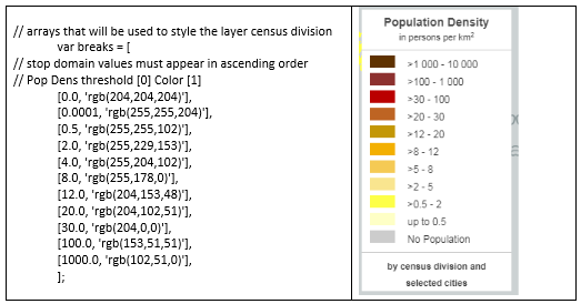
example, when a colour array is set for choropleth classes, a legend is generated automatically that inherits the symbols set. This is detailed in the OS Development document, under “Data driven styling and automated legend creation”, pp. 12-15, and a template is provided on GitHub.
For both ArcGIS Online and Mapbox versions, overall we found that performance improvements in speed of display were not as great as we had hoped. The Census Division polygons and linework are complex, even when generalized and optimized for web deployment, and serving these up is slower than one might wish. We experimented with various suggested fixes for this, in both software suites, but met with only moderate improvements. If you have comments or suggestions about these issues, or any other design aspects of the pilot projects, please feel free to post comments and discussion below, or to contact the author at byron.moldofsky@gmail.com.
For more detailed information about the work done on these pilot project web maps, we have mounted our technical development documents on this site, linked below. Also, for the Open Source coding we have posted the code used and some example “templates” on GitHub.
LINKS TO DOCUMENTATION
HACOLP “Population by Census Divisions” maps Open-Source Development Document
HACOLP “Population by Census Divisions” maps ArcGIS Online Development Document
For the code for the Open Source site, see: HACOLP Github Open Source Repository
This post is also available in: French