Category Archives: HGIS projects

Beard top photo

Historic Welland Canals Mapping Project

Mapping the historic canals one lock at a time!

Guest post by Colleen Beard, Brock University Maps, Data & GIS Library

Inspired by the rich local map and photo collections of Welland Canal history, this project (HWCMP – also available via Geohist Portal) illustrates an HGIS approach to reconstructing the past that has since captivated a large local audience – simply because it tells amazing stories!

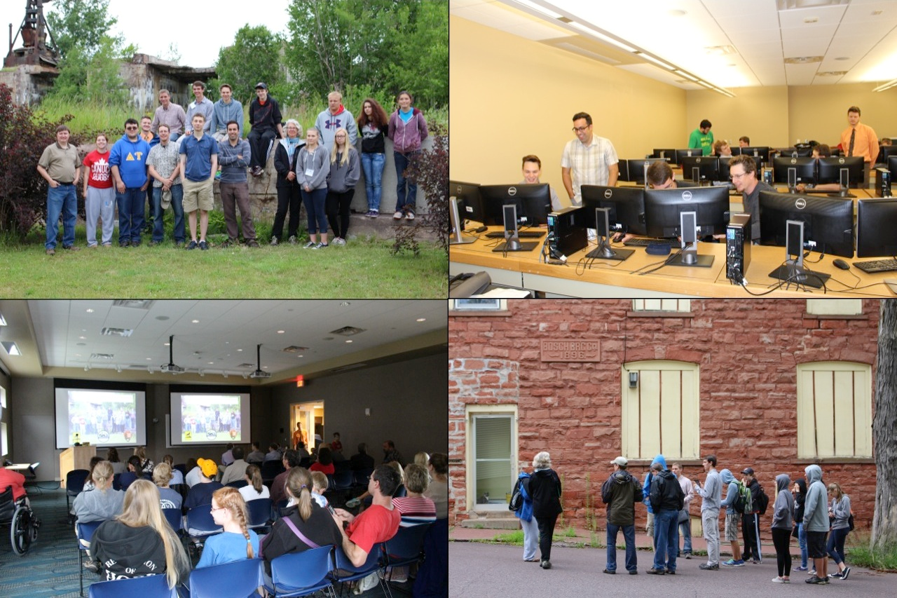
Recently I have realized that the success of an HGIS project should not be measured by the number of publications it generates, but how it educates and absorbs an audience on a greater scale. After a number of public presentations demonstrating the HWCMP web app with stories, this is what attendees had to say…

“It was a fascinating presentation that left me wanting more.”
(Brock Library staff)

“Colleen’s presentation was a blast. The room was packed and after talking for an hour, the woman beside me said, Colleen could speak for another hour. It was that interesting. Amazing job!!!”
(Posted to Friends of the Welland Canals FB page, Oct.26, 2017)

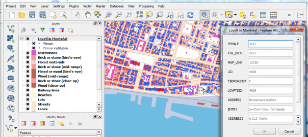
Although there are many approaches to historical GIS research, this one combines current mapping technologies with historical maps, air photos, and images, to reconstruct the three historic canals as they would appear on today’s landscape. While there are many books, maps, and websites that document the historic canals, there is little that represents the historic mapping of the canals with the detail it deserves. Many technologies from the suite of ArcGIS products available through the Esri educational site license were utilized: ArcMap Desktop, Collector for ArcGIS, ArcGIS Pro, ArcGIS online (AGOL), Web AppBuilder for ArcGIS, and Esri Story Maps.

Beard Overlaymap

First built in 1829, the Welland Canal routed ships to circumvent Niagara Falls – a height of 100 metres (325 feet) – between Lake Ontario and Lake Erie. No other canal in the world has overcome a slope as steep as the Niagara Escarpment to transport ships. Yet its history is known by few. Using HGIS processes, the three 19th century canals in St. Catharines and Thorold, Ontario – the First (1829); Second (1845), and Third (1887-1932) – were digitally recreated to overlay on the current landscape. (The current, and fourth, Welland Ship Canal is well documented and is not yet history!) Although most historic features have been bulldozed or left for ruin, many of the Second and Third canal features have survived in one way or another (if you know where to find them).

Building on the Welland Canals Google Earth project of several years ago, routes of the canals and its locks are no longer simple lines and points on a map. Extensive heads-up on-screen digitizing using ArcMap processes has resulted in an accurate representation of the historic canals – including every route, lock, bollard, weir, weirpond, bridge, tunnel, pier, and raceway! The geodatabase is unique with detail never before created. It offers a solid foundation for which to build other geodatabases, such as period industry activity, historical road networks, vegetation and other landscape changes. The data was recently used by an archaeology student, David Connelly, to create a proposal for re-purposing the historic locks and environs using 3D models: Re-Engaging the Welland Canals.

Building the HWCMP
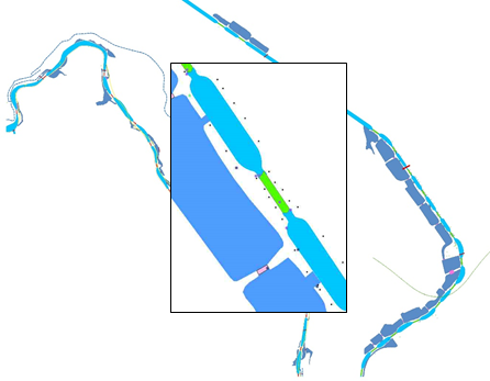
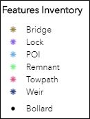
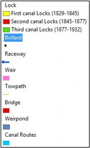
One of the goals of the project was to inventory all visible remains of the three canals, and to assess their structural integrity and ease of access. Of course, this required extensive field reconnaissance. Linked here is a map illustrating the hiking activity, either by foot, bicycle, or boat, covering approximately 80 kilometres. Collector for ArcGIS was used on an iPhone 6 Plus to inventory and capture the locations of all canal features. Photos and videos were attached that would later provide evidence to accurately assess their structural condition. The importance of geodatabase design that is used with Collector cannot be understated, and proved to be very convenient for documenting the canal features inventory. Determining classifications allowed features to be categorized at the time they were located in the field. These are illustrated in the web app Legend as the Features Inventory:

Beard Features legend An optional field was included in the geodatabase to enter brief text descriptions. However, when hiking in sub-zero temperatures this didn’t amount to much. Many of these descriptions were added later in AGOL and are included in the pop-up box with each feature. The photo and video attachments were critical in this assessment. Later, these would be deposited in the Brock Digital Repository for historical record, but more importantly to provide a sustainable url for including hyperlinks in the AGOL project.

Some preliminary mapping of the historic routes and locks also proved to be useful while hiking. This data was included as part of the map used with Collector. When in the field, I was able to determine an approaching canal lock or feature on my phone that was not clearly visible on site. If remnants were found, its location captured in Collector was a ground-truthing point that could later be used to accurately map the feature. This was particularly useful for locks and weirs where stone and concrete rubble were evident but the structure was deteriorating. High accuracy GPS or GPS averaging was not used. The resolution of Collector was at best within 3-5 metres, and to achieve this took patience while the iPhone reconfigured to the zoomed location. But it was good enough for the purpose intended!

As the vector data was created in ArcMap, feature classes were designed for the following:

Beard Locks legend 
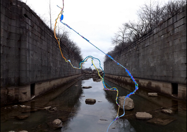
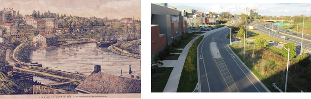
Attributes for the Lock and Weir feature classes included: visibility, condition; accessibility, and extensive description with photos – all included in the custom pop-up when a feature is “clicked” (selected) within the map view. The web app allows the user to interact with the historic routes of the canals, select its features and view modern photos of its current condition. Historical photos are also planted in the feature class tables and in some of the feature inventory pop-ups (the Collector points) that provides a “then and now” comparison of canal landscapes. Some are very startling, such as the Canal Valley through downtown St. Catharines (below) where the tranquil meander of the First and Second Canal waters have been replaced with parking lots, arenas, and a major highway. It’s a shame! But a reminder of why we engage in HGIS research in the first place.

Beard Scene side by side

The HWCMP digital vector data is currently available as open data in AGOL. It is anticipated that the data will also be accessible in several portals, including Brock’s Digital Repository, Scholars GeoPortal, and Niagara Open Data portal. One of the struggles is establishing an appropriate repository for data preservation, which continues to be investigated.

About the amazing stories!
To date, the project has been presented to the Historical Society of St. Catharines, The Brock Library staff, and has upcoming dates for the St. Catharines Public Library, Brock Geography Masters speaker series, the St. Catharines professional business retirees, and Carto 2018. An audience yet to capitalize on is the elementary/secondary school students!

The HWCMP talk is popular in the community because of the stories it tells. One is the story of the attempted terrorist attack to blow up Lock 24 of the third canal in 1900 – where the grandson of the convicted made contact with me, due to the web exposure of the HWCMP.

Others are the stories about mapping the canal features, uncovering remnants of old buried tunnels and providing image comparisons that take one back in time. Photo comparisons provide a remarkable “wow” factor to visualize landscape change. If there’s a compelling story to tell, it will seize the audience.

Colleen Beard, Brock University
cbeard@brocku.ca

QGIS Lovell in Montreal CROP

Montréal Market Vendors ca 1880 web-mapping pilot project

Quicklinks:
Open Source demonstration web maps (using Carto.com):
Lovell in Montreal City Directory 1880-81 base map
https://canadian-hgis.carto.com/builder/70212344-415a-11e7-9fef-0e3ff518bd15/embed
Final Map of Market Vendors Work and Home – With Widgets
https://canadian-hgis.carto.com/builder/a20b5b37-52ed-417b-b6fa-f73d618d6fcd/embed
ArcGIS Online demonstration web maps:
Lovell in Montréal 1880 Basic Web App: Original layers and ArcGIS Basemap
Montréal Market Vendors Work and Home ca 1880 Filtering App
http://hgisportal.esri.ca/portal/apps/MapAndAppGallery/index.html?appid=f081eb9a363c46caa37c77d132def423

For detailed pilot project development documents see links at end of this article.

Montréal, l’avenir du passé (MAP) has been a landmark project in Canadian historical GIS. Professors Sherry Olson, Robert Sweeny and their collaborators at McGill University recorded, mapped and analysed many of the data sets basic to understanding the context of urban history for Montréal in the 19th century: the urban fabric including building type from historical maps from 1825, 1846 and 1880; demographic data from a number of Censuses; information about local residents and businesses from City Directories. Their website, based at Memorial University, goes into details about these data and the various applications which have been made available for researchers and students to explore them. (http://www.mun.ca/mapm/)

However, as part of the open discussion at our Geohistory/Géohistoire project meeting in August of 2016, our collaborator Robert Sweeny expressed his disappointment (if I may paraphrase) at what might be called the failed promise of online mapping. Interactive mapping and GIS tools should not limit users to viewing pre-digested results of research, much as printed maps were able to do. These tools should allow active exploration of historical GIS-enabled data, including posing new or unanticipated questions, drawing out new or unanticipated spatial relationships – in short, allow the user to use GIS tools to explore and analyse data, in an online environment.

Many voices rose from the audience to assure Robert that online GIS applications and tools were under development at that time, and would soon enable the kinds of inquiry that he envisaged and expected. And truly, these tools have been emerging in the last year or two, both in the Open Source community and in the ArcGIS Online world. Robert may have been somewhat skeptical, but he remained ready to be convinced. And so when looking for pilot web mapping projects for our partnership in late 2016, we approached him with a question: would he come up with a scenario for proving the case that online GIS tools had come of age? That what students in his classroom had always needed full GIS software programs to achieve, could now be completed using a web browser?

What Robert responded with was a “Scenario for markets based on MAP’s 1880 Lovells QGIS application,” which appears as Appendix 1 in the full-length development documents for which links appear below. To quote a relevant section:
“As is still the case in many parts of the world, people in 19th century Montreal bought most of their food at markets… From west to east St Gabriel, St Antoine, St Anne, St Laurent, St James and Papineau wards each had their own market, while Marché Bonsecours on St Paul Street served as the main market…. In the Lovell’s city directory it was frequent for people who leased stalls in the retail markets to also list their home address. These addresses are an indication of how local the ward markets were. In this exercise we will be comparing this residential information with other variables to assess the character of these differing markets.”

The “other variables” Robert’s scenario is most concerned with are Occupational. He outlined a method using QGIS for drawing connecting lines between the work locations for Market vendors, and their residential locations (as well as these could be determined.) He then suggested different occupation types might have different residential patterns relative to the market work locations. Or perhaps different markets would exhibit more local or more far-flung connections to vendors’ homes. Identifying these locations and drawing the connecting lines between them opens up a wealth of analytical possibilities.

So this is what we attempted to do, first using the Open Source Carto tools, and then using ArcGIS Online. The resultant web maps illustration vendors’ work and home sites look remarkably similar (as one would hope!) Quick default views of these are pictured below: the Carto map showing all of the occupational categories, the ArcGIS Online map showing the symbols and lines just for “Butchers” in the markets.

Carto user view showing ALL vendors and connections
ArcGIS Online App filtered to show points and connections only for "Butchers"
ArcGIS Online App filtered to show points and connections only for “Butchers”

A side note: Unlike our other pilot projects, which focus on functionality and customization of coding for map design and presentation, this project is primarily about enabling the user to analyse and explore data interactively. Therefore rather than a breakdown of the code required to produce a final web-map, our detailed documentation consists of the step by step process for using the latest online tools from Carto.com and ArcGIS Online (as of mid-2017) to achieve the objectives of the exercise.

There are similarities, and there are differences, in how the two toolsets approach the tasks at hand, and the final products are certainly distinct. More similarities than differences exist though – which often prompts an intriguing conversation many of in online mapping have had: who’s following whom? No space to explore that question here, but feel free to post your own comments below.

Some of the similarities are superficial. For instance, the tools to achieve these products are fairly recent additions to their online toolboxes. Both software suites number these among what they both call “Analysis” tools. Their menu-driven editing interfaces look similar, as pictured below. Carto uses an Carto Builder “Analysis” tool called “Connect with Lines”, to create connections between point locations. ArcGIS Online uses an “Analysis” tool named “Connect Origins and Destinations”, to achieve a similar outcome. However, the AGOL tool is actually built to do network analysis and routing, and has much more sophisticated potential applications, whereas the Carto tool is limited to making straight line connections between points.

Table Connect with lines AGOL and Carto

Despite the relative limitations of the Carto tool, it does achieve the outcome required by this project – and the flip side of its simplicity is that it proved to be easier to use, and much more forgiving in terms of its data requirements than the AGOL tool. For example, the Lovell Montréal data set of work and home locations turned out to have many more work locations than homes – not all market workplaces had identifiable matching home locations. And some market workplaces had many more than one “home” location associated with them. The Carto tool sailed through these discrepancies, and drew lines between all the matching points without any issues. The AGOL tool on the other hand, popped up the following error messages, in turn:

AGOL O-D error message table
ArcGIS Online error messages for Origins-Destination

So in order to make the AGOL Origin-Destination tool work for our purposes, some significant data manipulation had to be completed – this is all described in the detailed documentation for those who are interested.

This is NOT to say that obliviousness to data discrepancies is always a virtue – trouble-shooting the data issues for the AGOL tool provided a much better understanding of which work points were actually connecting to which home points. Rather, it is just to say that, as usual, one must make sure that for any analytical task, the right tool for the job is identified and used.

In my estimation, both AGOL and Carto now provide the interactive online tools to map the data, and to allow the analysis for at least this specific scenario, that Robert Sweeny had desired for his students and other users of the Montréal, l’avenir du passé project data. However the question remains: is this an effective environment for doing this kind of work? GIS and other software providers are putting more and more functionality into browser-based “software as a service”, delivered online. The advantages are clear: any browsing device can access these GIS tools, nothing has to be installed locally, resulting in much broader access for users. The disadvantages: limitations in processing tools, limitations in interface and symbol design, and limitations in number of views allowed without paying fees. The question of what is best for any set of students or other users, requires a balancing of these issues.

Please feel free to post comments discussing these pilot projects using the space below.

For more detailed information about the work done on these pilot project web maps, we have mounted our technical development documents on this site, linked below.

LINKS TO DOCUMENTATION

Montréal Market Vendors ca 1880 Open-Source Development Document

Montréal Market Vendors ca 1880 ArcGIS Online Development Document

MapboxGrowthmap

Historical Atlas of Canada Population by Census Divisions 1851-1961 Web-mapping Pilot Project

Quicklinks:
Open Source demonstration web maps (using Mapbox, JQueryUI):
HACOLP Population Growth, Density, Distribution – by Census Division 1851-1961
http://mercator.geog.utoronto.ca/georia/mapbox-hacolp
ArcGIS Online demonstration web maps:
HACOLP Population Density by Census Division 1851-1961 Time Aware Apps (3 versions)
HACOLP Population Growth by Census Division 1851-1961 Time Aware App
http://hgisportal.esri.ca/portal/apps/MapAndAppGallery/index.html?appid=f7e6329dd6b3494b9b689e1750cf6781

For detailed pilot project development documents see links at end of this article.

The Historical Atlas of Canada was a three-volume collaborative research and publishing project, finished in 1993, which used maps, text and other graphic displays to explore themes in the history of Canada. A selection of the Atlas thematic “plates” was published online in 2008, using Esri’s ArcIMS technology, as the Historical Atlas of Canada Online Learning Project (HACOLP.) For more general information about that project see: http://www.historicalatlas.ca/website/hacolp/about.htm

One of the major themes explored in the Atlas was the sweeping population changes across the country through the century prior to the Atlas’ end-date of 1961. A number of demographic measures were used for different maps, periods and sub-regions, but when the HACOLP was put together, it was decided to create a chapter called Summary of Population Growth, 1851-1961, which would allow users to look at how change occurred over this whole period, contrasting three different cartographic representations.

The original website featured three interactive maps of population by Census Division, using three different symbolization methods: Population Density (choropleth), Population Growth (graduated circles) and Population Distribution (dot density) – for eleven Canadian census years, 1851 through 1961. These maps used the ArcIMS technology, and a customized Javascript legend using checkboxes to turn each year on or off.

The goal of this pilot project was to create new web maps to rejuvenate and improve the original maps, in performance and visualization. Using data provided by HACOLP, these maps have been reproduced for this pilot project while being updated to current web-mapping standards, and implementing a Time-slider tool to click through the census periods, replacing the original checkbox interface. We also envisaged this project as an appropriate one to use to explore the web-mapping software’s capacity for legend design flexibility, and for map projections other than the standard Web Mercator.

As planned for this project, we designed and produced two different versions for each of these map themes:  one using the ArcGIS Online platform and another using Open Source software and web serving tools, in this case primarily the Mapbox and JQueryUI javascript libraries.

The ArcGIS ONLINE VERSIONS can be found on the Geohistory-Géohistoire Canada Development Portal (technically an ArcGIS Enterprise portal) hosted online by our partners at Esri Canada, at: HACOLP Population Apps Gallery. To view other Portal content go to: http://hgisportal.esri.ca/portal/home. The “Gallery” contains 4 apps: one for Population Growth (graduated circles), and three versions of  Population Density (choropleth) – one in Web Mercator, another in Lambert Conic Conformal, and the third using an on-the-fly tile generating configuration, for comparison of performance. We also made a version of the app to test the “Optimize Layers” procedure, available in ArcGIS Online but not in the Portal environment. These comparative methods are explained in the detailed ArcGIS Online Development Document (see link below) – you can view them to compare their performance for yourself. The Lambert version highlights the capacity for alternative projections in ArcGIS Online, which are rather easily done. On the other hand, Dot Density mapping was not readily possible using the tools at hand.

ArcGIS Portal Population Density Map using Lambert Projection

The Mapbox versions of the HACOLP maps are being hosted on a server in the Department of Geography at University of Toronto. We were able to generate maps for all three types of representations using Mapbox. However, it does not provide support for projections other than Web Mercator. The maps have been put into a single home page displaying images of each, with mouseover links to the interactive maps. They can be found here: http://mercator.geog.utoronto.ca/georia/mapbox-hacolp.

Mapbox is a cloud-based open-source mapping platform for custom-designed mapping. It is built on vector tiles for rendering maps, and they developed this format, “an advanced approach to mapping where data is delivered to the device and precisely rendered in real-time.” (www.mapbox.com/maps) Vector tiles provide a vector version of the image-tiling technology that Google used to revolutionize web mapping performance. Esri and other industry leaders are now using vector tiles for their base mapping.

Mapbox provides a number of easy to use tools for online map and data management and map composition, like ArcGIS online. However it is still primarily an Open Source development environment, providing customization through a number of Developer Tools (SDKs and APIs) which are summarized online here:  https://www.mapbox.com/developers/  For newcomers to Mapbox, our OS Development document, linked below, provides an “Overview of the Workflow in Mapbox” (pp. 3-4) that we used for creating the pilot project web maps.

One of the areas where Mapbox is rather Do-It-Yourself, is legend composition. As opposed to ArcGIS, where legends are easy to include but rather inflexible, Mapbox leaves you as a designer pretty much on your own. Therefore we undertook the challenge to create code to generate a legend based on the same array set up for classifying map data. So for

Choropleth legend array as coded in Mapbox

example, when a colour array is set for choropleth classes, a legend is generated automatically that inherits the symbols set. This is detailed in the OS Development document, under “Data driven styling and automated legend creation”, pp. 12-15, and a template is provided on GitHub.

For both ArcGIS Online and Mapbox versions, overall we found that performance improvements in speed of display were not as great as we had hoped. The Census Division polygons and linework are complex, even when generalized and optimized for web deployment, and serving these up is slower than one might wish. We experimented with various suggested fixes for this, in both software suites, but met with only moderate improvements. If you have comments or suggestions about these issues, or any other design aspects of the pilot projects, please feel free to post comments and discussion below, or to contact the author at byron.moldofsky@gmail.com.

For more detailed information about the work done on these pilot project web maps, we have mounted our technical development documents on this site, linked below.  Also, for the Open Source coding we have posted the code used and some example “templates” on GitHub.

LINKS TO DOCUMENTATION

HACOLP “Population by Census Divisions” maps Open-Source Development Document

HACOLP “Population by Census Divisions” maps ArcGIS Online Development Document

For the code for the Open Source site, see:  HACOLP Github Open Source Repository

Lost Rivers OS site

Lost Rivers of Toronto Web-mapping Pilot Project

Quicklinks:
Open Source demonstration web maps (using Leaflet, JQueryUI):
Lost Rivers of Toronto – Disappearing Rivers – Timeline
Lost Rivers Ashbridge’s Bay Area Walks scrolling map tour (3 walks)
http://mercator.geog.utoronto.ca/georia/lostrivers/
ArcGIS Online demonstration web maps:
Lost Rivers of Toronto – Disappearing Rivers – Timeline App (2 versions)
CHGIS Lost Rivers – Ashbridges Bay Story Map (McMurrich 1882) App
http://hgisportal.esri.ca/portal/apps/MapAndAppGallery/index.html?appid=3272511933fa41498201836717b41a27

For detailed pilot project development documents see links at end of this article.

The Lost Rivers Walks project (http://lostrivers.ca/) takes people on guided walking tours around the city of Toronto “…to create an appreciation of the city’s intimate connection to its water systems by tracing the courses of forgotten streams, by learning about our natural and built heritage and by sharing this information with others.” They are one of the community partners of Geohistory-Géohistoire Canada. For many years they have been using historical cartographic and other archival sources, interviews with long-time residents, and on-the-ground encounters with the topographic peculiarities of the city to draw the map of Toronto’s drainage pattern as it must have been before the city-building process forced much of it underground.

With Helen Mills and John Wilson representing the Lost Rivers project, we decided to create web-maps for this pilot project on two different themes:
1. Disappearing Rivers of Toronto:  A map of the city of Toronto showing the original stream network of the city, and how those streams disappeared over time as they were buried for purposes of development.
2. Lost Rivers Ashbridge’s Bay Area Walks:  A series of interactive maps dynamically illustrating the stops along the way for three of the walks offered by Lost Rivers in this area of Toronto’s eastern waterfront, linking the locations of the stops, and pictures and text related to each, in a “map tour” format.
Links to all of the maps are embedded below.

As planned for this project, we designed and produced two different versions for each of these map themes:  one using the ArcGIS Online platform and another using Open Source software and web serving tools, in this case primarily the Leaflet and JQueryUI javascript libraries.

The ArcGIS ONLINE VERSIONS can be found on the Geohistory-Géohistoire Canada Development Portal (technically an ArcGIS Enterprise portal) hosted online by our partners at Esri Canada at: Lost Rivers of Toronto Apps Gallery. To view other Portal content go to: http://hgisportal.esri.ca/portal. The “Gallery” contains 3 apps. This is because there are two versions mounted of the Disappearing Rivers of Toronto app. One is hosted on the portal itself, using a “standard” timeline slider to turn the rivers off as they “disappear” over time. That timeline slider looks like this:
ArcGIS_standard_timeline
This version of the app was built using ArcGIS Online Web AppBuilder, which is a very user-friendly tool which allows authors of web maps to drag and drop user interface components like this standard “Time Slider” widget into their web app. The widget can even be configured specifically for one’s map and data, in limited ways, such as the icon that is used for the tool, and whether the time-specific layers are indicated above it.
For more info on the Web App Builder see: http://doc.arcgis.com/en/web-appbuilder/

However, more sophisticated customizations which may be desired, or even necessary, are not possible. For example, the slider has two “handles”, set at 1830 and 1840 in the picture above. Each one can slide forward or backward along the timeline independently, to select a “range” of data. This design is very appropriate for some applications – however when the goal is to illustrate a “snapshot” of the environment at a single point in time – like our “Disappearing Rivers” map – it can be confusing, and the resulting map may be unclear. A slider design offering only one handle to the user, identifying a single point in time, like the picture below, simplifies and clarifies the interface.
ArcGIS_custom_timeline

This customization was only made possible by hosting the app on an independent server (i.e. not on ArcGIS online itself, or the Geohistory Portal) and using the Developer Edition of the Web AppBuilder for ArcGIS (https://developers.arcgis.com/web-appbuilder/). This is a rather complicated process requiring the installation of the development app on a local computer, registration of the app on the Geohistory Portal so that portal-based web maps may be incorporated, development and testing of the app and customizations on the local computer, deploying the app on the independent server, and then registering the final app on the Geohistory Portal so that it is accessible there.

The OPEN SOURCE software versions of the Lost Rivers maps are being hosted on a server in the Department of Geography at University of Toronto.  The maps are incorporated into a single web page with top-bar links to the Disappearing Rivers map, and each of the Ashbridge area walks. They can be found here: http://mercator.geog.utoronto.ca/georia/lostrivers

In contrast to the ArcGIS Timeline slider, the Timeline slider used for the Disappearing Rivers map is one of a set of generic JQueryUI slider tools, adapted for the specific needs and time frame of our map. (http://jqueryui.com/slider/) The version we arrived at looks like this:
JQueryUI_custom_timeline_lostrivers

Working with generic Javascript tools has pros and cons. The advantages have to do with the transparency of the coding related to design. The JQueryUI API documentation is thorough and the techniques use fairly basic Javascript and CSS coding. We were able to adapt the tool and tweak the graphic design of it without much problem. The ArcGIS Web AppBuilder widgets, although fully available for customization, use a more complex design framework and the Dojo Toolkit (https://dojotoolkit.org/), so are not as accessible to less-than-expert programmers. And as described above, the system the ArcGIS templates are embedded within and the workflow required, is rather complicated. In comparison to customizing the ArcGIS Web AppBuilder App, the workflow involved in developing the Leaflet-based site was extremely simple. Documents could be written and tested on local drives, and uploaded to a web server when completed.

The disadvantage of working in the simpler generic environment is a reduction in functionality, what could be termed the native intelligence of the application. In this context, using GeoJSON for the Rivers overlay there is no concept of “time-aware” data. The line data is displayed based on a simple query of the integer field value, in this case the “Year last seen on map”. This worked fine for our year-based attribute data, but any more sophisticated queries based on chronology, or using a variety of time formats, could be very problematic to code, or at least more complicated to integrate into the interface.

There is not enough space here to go into the production of the Lost Rivers Ashbridge’s Bay Area Walks web maps, but a similar process occurred regarding ArcGIS Online and parallel Open Source development. For more detailed information about the work done on these pilot project web maps, we have mounted technical development documents on this site, linked below.  Also, for the Open Source coding we have posted the code used and some examples on GitHub. For further questions about the projects, please feel free to post comments and discussion below, or to contact the author at byron.moldofsky@gmail.com.

LINKS TO DOCUMENTATION

Lost Rivers Toronto “Disappearing Rivers” Map Open-Source Development Document

Lost Rivers Toronto “Disappearing Rivers” Map ArcGIS Online Development Document

Lost Rivers Toronto “Ashbridges Walks Maptour” Open-Source Development Document

Lost Rivers Toronto ” Ashbridges Walks Maptour ” ArcGIS Online Development Document

For the code for the Open Source site, see: Lost Rivers Toronto Github Open-Source Repository

OCUL site banner edited crop2

OCUL releases over 1000 early topo maps of Ontario…

Guest post by Amber Leahey, Scholars Portal, and Jay Brodeur, McMaster University Library

The Ontario Council of University Libraries (OCUL1) is pleased to announce the release of a shared digital collection of more than 1000 early topographic maps of Ontario, now available online!

Map libraries are really wonderful places–just ask any Librarian or staff member who provides patrons with services, guidance, and access to maps and associated cartographic material at university libraries across Ontario. Or better yet, ask the countless patrons who use the collections’ vast and varied information to support activities in their research, education, work, and private lives. Indeed, there is much to be said about sparking interest in maps and GIS by telling a story with old maps–which there are many of–at libraries across the province. With such rich and diverse map collections, and thanks to the careful curation and digitization of over 1000 early topographic maps of Ontario, academic libraries continue to play a key role in preserving our national and provincial heritage in the digital age.

Led by the OCUL Geo Community, the OCUL Historical Topographic Map Digitization Project is a province-wide collaboration to inventory, digitize, georeference, and provide broad access to early topographic maps of Ontario. The initiative represents the single most comprehensive digitization project of the early National Topographic Series (NTS) map collection in Canada. The publicly-available collection provides access to georeferenced topographic maps at the 1:25000 and 1:63360 (one inch to one mile) scales, covering towns, cities, and rural areas in Ontario over the period of 1906 to 1977. As the collective achievement of individuals representing university libraries across Ontario, this shared collection exemplifies OCUL’s continuing commitment to collaborative approaches that improve access to knowledge both within and beyond the province. The completion of this project also serves as an opportunity to reflect on the history of the OCUL Geo Community, and celebrate the shared vision and effort that have made possible the current achievement.

The significance of historical maps

Much like a photograph, landscape painting, or textual account, a historical or otherwise superseded map preserves information from the past and provides its viewer an opportunity to explore the ways in which environments, cultures, and human knowledge have changed over time. As a part of their mission, map collections, libraries, and archives have a long tradition of preserving and providing access to a wide array of cartographic and cultural information.

In the present day, early topographic maps are a critical resource for those with an interest in historical events and exploring change over time. For many researchers, local historians, planners, conservationists, engineers, and consulting firms (to name but a few), historical topographic maps provide a unique snapshot of a given time period, showing both man-made and natural features such as spot heights, waterways, shorelines, boundaries, roads, railways, houses, barns, electricity lines, industry, agriculture, and much more.

Ottawa’s Changing Landscape and Growth 1906-1948
Animated compilation of early topographic maps of the Ottawa area, showing changes and growth between 1906 and 1948.
From curation to digitization: The role of the OCUL Geo Community

Among the challenges faced in producing such a comprehensive digital collection is the effort required to inventory and bring together sheets that exist across a multitude of map libraries. Given the variety and quantity of maps that are created during any given period and the finite nature of storage space and budgets, map collection curators are required to make careful (and often difficult!) choices about the collections they develop, steward, and preserve over time. As a result, many institutions have focused their topographic map collections around items of local relevance and significance. In Ontario, for example, the maps that make up the digitized series–originally produced by the Department of National Defence (until 1923: the Department of Militia and Defence)–are dispersed across many Ontario University Libraries. Over the years, Ontario libraries have collaborated to develop a comprehensive inventory of known maps from the series in existence, working closely with the Ontario Archives and Library and Archives Canada more recently for this digitization project. That the vast majority of sheets in these collections could be found at OCUL institutions is a testament to the foundational work of the early Geo and Map Communities.

As the predecessor of the OCUL Geo Community, the OCUL Map Group (then known as the OULC Map Group) was formed in 1973 with the goal of communicating and collaborating on map-related projects. Among their completed initiatives was the creation of a union catalogue of topographic maps across institutions. The importance of this work to OCUL Geo’s current-day success shouldn’t be overlooked, as these foundational efforts provided a means for coordinating map collections across OCUL institutions, and helped ensure maximal collective coverage in a cost- and space-efficient manner. Today, the OCUL Geo Community continues the goals of its predecessor, with a commitment to fostering dialogue around important issues such as best practices for the digitization of maps in libraries, access to maps and GIS for research, and collaboration on a variety of library activities in these areas.

Moving forward, the group plans to engage with the wider map community in Canada about the project, specifically at the upcoming Association of Canadian Map Libraries and Archives Carto 2017 Conference being held in Vancouver, B.C. in June (ACMLA website). The group hopes to identify opportunities to build on the project, engaging with other university libraries and archives, to digitize maps from this national collection.

We are very excited about this release, please let us know how you may be using the maps for your next project! For more information or to get in touch with us contact the project members at topomaps@scholarsportal.info.

We hope to hear from you!

1 OCUL is a consortium of 21 University Libraries in Ontario, and fosters collaboration around library activities and services including map and GIS collections, digitization, and digital curation.  Ontario’s university libraries have been working together through OCUL on initiatives such as this since 1967. In 2017, OCUL is celebrating its 50th anniversary, and this project demonstrates the ongoing success of this collaboration.}

Neptis Geoweb 4

The Neptis Geoweb: A behind-the-scenes look into the underpinning framework

Guest post by Vishan Guyadeen, Neptis Foundation. Neptis is one of the collaborating partners of the Canadian Historical GIS project. 

The age of data is upon us. Data from different fields, quality, and types have become more and more available. However, in many cases it can be hard to glean valuable information from data because one might not be able to easily visualize and/or compare it with other datasets.

In studying the forces that make up and shape urban regions, it is particularly difficult to contextualize data since it exists in many different places.  The Neptis Geoweb is an interactive mapping and data visualization platform that aims to address this issue. Specific to the Toronto region, the Geoweb utilizes data that is normally siloed in various government organizations to make the complex policies shaping the region more accessible and easier to understand.

One subject that requires data that is often difficult to obtain, understand and visualize is the history of the Greater Golden Horseshoe. The Neptis Geoweb has a unique feature – the Timeline, which guides the user through milestone policies/events that have helped to shape the region into its current state. The Timeline is an interactive feature that describes and visualizes milestones in the regional context. Users may also compare these historical map layers with other current and historical datasets for further context.

Neptis Geoweb showing historical information about Region of Niagara, keyed to timeline below map

Creating a platform that is capable of showcasing and managing large quantities of data is not an easy undertaking. The Neptis Geoweb was built with a fully customized framework, which allowed for easy access, clear and up-to-date data, as well as the ability to maintain different types of content (e.g. maps, charts, and text). There are two main underlying components that make this possible.

First, the most important component of the Neptis Geoweb is Carto (formerly CartoDB). Carto is a cloud-based GIS platform that houses and queries all of the data layers on the Geoweb. Carto was utilized because it is a powerful and flexible platform that is easy to use. For example, Carto provides the ability to quickly manipulate data in the cloud using SQL and also visualize spatial data using either a user-friendly wizard interface or an advanced CartoCSS editor (see screenshot below). Further, Carto provides the Geoweb with the flexibility of using various data types and the ability to seamlessly interact with other platforms such as Leaflet, MapBox, and OpenStreetMaps. These additional platforms enhance the overall functionality of the Geoweb. Carto offers these and many other benefits to the Geoweb while maintaining an overall ease of use that doesn’t always require a GIS professional.

Carto graphic interface for editing layer graphics using CartoCSS (one of several methods)

Second, the administrative interface of the Neptis Geoweb was custom-built by Carto developers, to organize and maintain map layers and other non-spatial content. Neptis staff are able to prepare, organize and maintain content such as map layers, municipal data profiles, and short topic stories. When dealing with large quantities of raw data and map layers, it is essential to have a way of managing content. The admin interface contains simple forms that make up the content shown on the Neptis Geoweb. The screenshot below shows part of the form that is required when creating and updating map layers.

Neptis Geoweb custom administrative interface - form for New Layer
Neptis Geoweb custom administrative interface – form for New Layer

This is a brief introduction to the Neptis Geoweb and the two main components that make it an efficient platform. Like Carto and web mapping as a whole, the Neptis Geoweb is an evolving project. As more data becomes available – whether relating to local areas, the region or beyond, the intent is to continue to enrich the Geoweb.

The Lost Rivers Project: The Case of Holly Brook

Guest post by John Wilson, Lost Rivers Project

A few weeks ago my friend Joanne Doucette sent me an amusing email with the Subject line “Holly Brook”. It included a Toronto Star clipping from April 11, 1907, reporting on a request that the city build a box drain on the property of the Phillips Manufacturing Company on Carlaw Avenue. The drain would divert a natural watercourse flowing near where the company wanted to lay the foundation of its new factory building. Also attached to the email was a composite photo of Joanne’s own face with a dead crow apparently poised on her lips.

Now Joanne Doucette has no need to eat crow. She is very arguably the foremost Leslieville historian. She literally wrote the book – Pigs, Flowers and Bricks: A History of Leslieville to 1920. But Joanne and I have had a disagreement brewing for several years as to the exact location of Holly Brook a.k.a. Heward Creek, one of a dozen or more “lost rivers” draining the eastern Toronto waterfront between Scarborough Bluffs and the Don River.

Determining the former course(s) of streams and creeks that city engineers have buried, diverted or otherwise trashed to prepare the ground for building our rational, grid-patterned city is the self-appointed job of a small collection of Lost River walkers associated with the non-profit, charitable Toronto Green Community. The job entails iterative research, ground-truthing, collaborating, outreach and documentation. Lost River is a project founded by Helen Mills, recognizable largely due to the lostrivers.ca web site created by the late Peter Hare. Today the web site needs wholescale updating, but the project moves forward in large part through the diligence of the Lost River Walks program to which I contribute. We are a small community of activists and academics, urbanists and naturalists, all of us geographical historians in some way.

On Holly Brook there is contradictory mapping. The creek is the closest East End stream to the Don River and central Toronto.

East End Watercourses in Toronto, overlaid on Google Maps. (To open interactive version on Google Maps in new tab, click on map)

With urbanization it was filled completely and early – by the late 1800s.  The creek’s lower courses were severely altered by John Russell’s brickmaking operations. Maps issued by the City Engineer’s office in the 1890s showed a watercourse flowing south between Gerrard and Queen Street well east of Carlaw, as shown in this map.

Map issued by the City Engineer’s office in 1899

But one map, a Plan of Survey of Lot 13 dated 1884 (but showing internal indications of having been based on a much earlier survey), details the watercourse flowing west of Carlaw until it crosses at the location of the Phillips building discussed in the 1907 Star clipping.

Modified Plan of Survey of Lot 13, 1884 (click to see full size plan in new tab)

I have spent many hours travelling the city’s streets and laneways looking for signs of lost rivers and ravines. My street-level observation of Holly Brook’s course was simple – whatever the City Engineers may have drawn on 1890s maps, water doesn’t flow uphill! To understand the watershed of historic Holly Brook another hypothesis is necessary, one that corresponds to the data on the Plan of Survey of Lot 13.

For lost river aficionados this kind of exploration is more a passion than a pastime. Our memory bank, gathered from explorations and shared with colleagues on Lost River Walks, represent data sets as yet under-documented in the layering of geographical information that is coming together in, for example, the Don Valley Historical Mapping Project, to which we remain a committed partner.

Holly Brook’s historic course may seem solely scholastic, but my experience is that this kind of enquiry teaches us valuable lessons about the building of our city and about living sustainably within our community. It helps us express important values about our place and the place of nature in the 21st century urban environment.

Today young people in households of one, two and sometimes more are recolonizing the former factory buildings on Carlaw Ave. Across the street from the former Phillips Manufacturing Company site, where Holly Brook undermined the foundations, the Rolph-Clark-Stone lithography building is now home to a new Leslieville condominium community. How many are puzzled by the deep basement windows facing Carlaw that peer out below sidewalk level? These windows seem to reflect the condition at the time of construction when the building’s foundation was laid far below current street level, buried deep into the former Holly Creek bed.

This sort of observation demonstrates how Lost Rivers provide clues as to why the city has been built in just the way it has been. Other common examples come from the street grid. Toronto’s main rectilinear layout is disturbed when streets are broken (example, St. Clair) or mysteriously jog (example, College), to accommodate a creek crossing. Similarly, diagonal off-grid streets often follow a height of land between streams (examples, Vaughan, Danforth Road). The engineering of rail lines had to take into account the landforms created by watercourses. These decisions have impacts upon subsequent city-building that echo over centuries.

Holly Brook’s effects recently “surfaced” again. Toronto’s Transportation Division and the TTC are planning a subway “Relief Line” (sometimes called “Downtown Relief”). The line will run south from Pape station at Danforth Ave., but stakeholders in Leslieville are struggling over a choice between a Pape or Carlaw orientation for the subway tunnel. Pape is a quiet residential street near Queen, while Carlaw is a bustling, mixed-use artery. It seems that Carlaw would be a better choice for the tunnel, but for one issue. Below Carlaw there flows a combined (stormwater and sanitary) sewer – the remnant of buried Holly Brook flowing south from Playter Estates, past Withrow Park, through Riverdale. Further, an east-west combined sewer along Gerrard St. diverts the some of the flows to Ashbridge’s Bay Treatment plant. A subway line below Pape could be tunneled below these sewer lines, but along Carlaw these sewers would have to be rebuilt. The cost premium for building below Carlaw, where buried Holly Brook flows in its degraded, post-industrial form? Around $300 million!

This is a point where Lost Rivers research seems more than solely academic and becomes more directly activist. Toronto will not “replumb” all its streets any time soon, but there are ongoing, recurring costs in treating water as a barrier to growth, rather than as a resource. If the flows of streams like Holly Brook would be naturally integrated into the urban fabric, they could become a natural and social benefit, rather than just barrier to city-building.

With examples like this the Lost Rivers project seeks to overlay historical mapping, storytelling, archival image collection, water infrastructure documentation, and personal responsibility to contribute to an enhanced collective dialogue about care for Nature in the City – air, water, land, other species and one another – in a way that sustains life through this century and beyond.

North Saskatchewan River flowing through Edmonton, Alberta

Whose ‘Ribbon of Green’? HGIS and the Histories of Edmonton’s River Valley and Ravines System

By Mo Engel, Shannon Stunden Bower, Andrew Tappenden, and William Van Arragon

Cross posted from niche-canada.org

Our colleagues and friends at NICHE (Network in Canadian History & Environment) and The Otter/La Loutre have just published an interesting article on an Historical GIS project based at the University of Alberta. They have generously offered it for cross-posting here. The project’s partners share many of the same goals as our Geohistory/Géohistoire efforts, and we hope to work with them closely in the future.

Part of the article reads as follows:
“The primary goal of our project is to build understanding of the complex and conflictual histories of Edmonton’s river valley. We are working toward that goal in several ways. One major effort is directed toward the production of a digital atlas highlighting the lesser-known histories of Edmonton’s river valley. Conceived as a work of public history and animated in part through the use of Geographic Information Systems [GIS], the atlas is aimed at a general audience. Over the past few years, project participants have been working to develop a purpose-built platform to display compelling historical evidence (photos, documents, film, maps, etc) within spatially-oriented narratives. The effort has involved computer scientists and digital humanists collaborating with historians to produce software intended to provide a more satisfactory means of framing arguments about the significance of particular spatial and historical processes. Once sufficiently functional, the software will be released in an open source format. In this way, it will position non-experts to deploy advanced GIS tools in the service of community-based research and dissemination.”

Demonstrating one of the capacities of our digital atlas, this clip integrates an 1882 Map of Edmonton as a tile layer with varying opacity over the current (2017) OpenStreetMap data. The annotated regions highlight 1882 state-sanctioned land ownership and are displayed in juxtaposition to the current land usage. All materials are in the public domain.

You can read the entire article at this link.

Using MapScholar.org to visualize maps in the Murray collection

Using Mapscholar.org to put the Murray Maps of Canada ca 1761 online

Guest post by S. Max Edelson, University of Virginia

This semester, I’m leading a group of University of Virginia undergraduates in a collaborative, project-based digital humanities course to put the Murray Map of Canada online in a dynamic digital exhibition. Taught as a selective Pavilion Seminar, this “Digital Practicum in Map History” is a hands-on experience that combines traditional reading, writing, and discussion with a workshop in digital humanities development. It involves an interdisciplinary focus on the history of cartography, visual design, digital humanities, public history, and the global history of empire.

As librarians scan the contents of their map archives, preserving fragile artifacts by creating high-resolution images, new tools are being developed to present these vital historic objects to a broad public audience. One of those tools is MapScholar, a distributed, browser-based visualization authoring tool purposed-built for illustrating scholarship in the history of cartography. With support from the ACLS and the NEH, research scientist Bill Ferster and I built MapScholar at University of Virginia’s SHANTI (Sciences, Humanities, and Arts Network of Technological Initiatives). My primary goal was to build a dynamic platform to display some 300 maps that are the subject of my forthcoming book, The New Map of Empire: How Britain Imagined America before Independence (Harvard University Press, 2017). Among the many maps I examined for this research, I was intrigued by the Murray Map collection at the William H. Clements Library at the University of Michigan. This huge manuscript collection–copies of which are also held by the British Library and the Library and Archives of Canada–seemed an idea source to mount and view online, bringing all of its disparate pieces together through georeferencing to fully appreciate the scope and ambition of this eighteenth-century surveying and mapping project.

When British forces occupied New France in 1760, the territory’s military governor, General James Murray, initiated a comprehensive survey of what would become, after the formal cession in 1763, the British colony of Quebec. The impulse to map Quebec came from military rather than administrative designs. Murray expected the province to be handed back to France after the peace had been negotiated, and he wanted to gather strategic intelligence that might be useful in support of a future invasion. As Murray explained to William Pitt in 1762, with this survey in hand to reveal the intricate passages along the waterways of the St. Lawrence River valley, Britain “never again can be at a loss how to attack and conquer this country in one campaign.” Murray dispatched eight army engineers to lead surveys along different sections of the river. The composite map they produced contained seventy-four separately mapped sections that, when joined together, formed an interconnected image forty-five feet long and thirty-six feet tall. Representing space at the scale of two thousand feet to one inch, these maps were among the highest resolution topographic maps produced by eighteenth-century surveyors anywhere. The Murray maps’ design as a strategic profile of the province was made clear by the addition of demographic summaries that enumerated how many men capable of bearing arms lived in each district.

Map curators Brian Dunnigan and Mary Pedley at The William L. Clements Library at the University of Michigan provided high-resolution scans of the Murray Map and have met with the class via video conference to help us develop it. As students georeference maps, design dynamic visualizations, record object metadata, manage distributed web resources, and write essays and annotations that provide context and interpretation, they will gain first-hand experience in digital humanities work.

We are beginning to georeference the collection now, and I will provide updates about our progress in a future blog post.

S. Max Edelson is an Associate Professor at the University of Virginia in the Corcoran Department of History.

Map Your History! Building and Sharing a Historical Spatial Data Infrastructure with the Keweenaw Time Traveler Project

While Historical GIS (HGIS) has become a familiar approach in the social sciences and humanities (Gregory and Geddes, 2014), recent trends in the social science use of GIS have called for HGIS implementations that can apply Big Data-based HGIS approaches to more qualitative research questions and, perhaps most importantly, more closely involve the public. Approaches range from allowing users to contribute to HGIS research using improved web interfaces, such as the New York Public Library’s Building Inspector, to the expansion of qualitative HGIS research (Olson, 2011; Lafreniere and Gilliland, 2015). In the broader world of GIScience, researchers have developed hybrid qualitative/quantitative tool combinations that expand the research potential of GIS further still (Kwan and Ding, 2008; Jung and Ellwood, 2010); these have more recently become topics of interest in the HGIS community as well. As part of this trend, Michigan Technological University’s Historic Environments Spatial Analytics Lab (HESAL) is preparing to launch the Keweenaw Time Traveler project – combining the latest generation of historical spatial data infrastructure with Web 2.0 technology and public outreach in ways that foster closer connections between research and the public by making history both fun and accessible.

Our Subject in a Nutshell: The Copper Country

The Keweenaw Time Traveler Project (KeTT) brings to the public a regional HGIS focusing on the Copper Country of upper Michigan, a region of the Midwest USA that contains the world’s largest deposits of nearly pure elemental, or native, copper. Native Americans exploited this resource for thousands of years; a subsequent industrial copper boom in the mid 19th century led to the area becoming the world’s largest supplier of copper by the 1880s, with a rapidly growing population and massive mining infrastructure quickly built in what had been a remote, if beautiful, wilderness. By the end of WW I, economic factors coupled with the growing cost of extraction led to a long, slow decline in the Copper Country’s mining economy, ending with the closure of the last mines at the end of the 1960s. When mining activity ceased, the entire region became a vast industrial archaeology site, a relict landscape. Today, with the population a fraction of its historical peak, the Copper Country’s economic base has largely shifted to service and tourism; local identity remains closely tied to Keweenaw’s mining heritage, however, and the area attracts visitors as much for its mining history as for its natural beauty.

www.mapyourhistory.org

Building the Foundation of the KeTT: Datasets and the
CC-HSDI

The Keweenaw Time Traveler benefits from the richness of historical data found within its geographic area of focus. The largest historical copper mining companies in the region, such as the Calumet & Hecla and Quincy mining companies, were among the great industrial giants of their day; the scale of their enterprise required a vast industrial infrastructure along with company towns to house their workers, all of which had to be designed, built, and paid for. As a result, most of the towns and large mining locations in the Copper Country are extraordinarily well-documented in the form of an extensive body of Sanborn fire insurance plans (FIPs), company-produced maps with detail that even surpasses FIPs, plan drawings and blueprints. In an age of corporate paternalism and scientific management practices, mining companies also extensively documented the lives of their workers and their families; the KeTT team has begun the digitization of an unprecedented wealth of detailed records on company housing, employee records and health records that provide far more information than standard census data. These are combined with decennial census data from the Minnesota Population Center, business and phone directories, and school records to provide a uniquely detailed look at the history of an entire region down to the level of the individual over the course of a century.

The core of the project is the Copper Country Historical Spatial Data Infrastructure (CC-HSDI), a next-generation implementation of HGIS designed to better facilitate both quantitative and qualitative research, while also fostering public engagement with both local history and the concept of HGIS itself. Using ArcGIS Desktop, ArcGIS Server and a PostgreSQL geospatial database, the CC-HSDI contains a series of ESRI Map Services consisting of georeferenced maps or FIPs broken into a series of time slices roughly equating with census years (in addition to smaller collections of maps from other years). Building these map service presented an early challenge to the KeTT team, as the size of each map service (representing a single town in a single year) ran into the tens of gigabytes and required the establishment of a dedicated PostreSQL geospatial-enabled server at Michigan Tech. Subsequent expansion of the HSDI will require these services to migrate to an off-premises enterprise-scale server facility (Amazon AWS) in the near future.

The historical built environment of each time slice in the CC-HSDI is then hand-digitized from the map services, resulting in over a hundred thousand building footprint polygons (as well as roads, rail lines and a few other infrastructural components). These polygon shapfiles serve as the geographical anchor point for all of the CC-HSDI’s non-map-based historical data mentioned previously and constitutes the “built environment stage” of the HSDI (after Lafreniere and Gilliland, 2015). This stage not only includes the building footprint itself, but other relevant data transcribed from the FIPs including the spatial arrangement,  street address,  and number of stories for each building.

Linked to the built environment stage geodatabases are non-map sources including data from the nearest census, business directories, phone directories, and company and school records. These records capture the social environment of each time slice in incredible detail, including whether a primary school student was immunized, or the medical profile of mining company employees. Coupled with the census data and business directory data that are already staples of HGIS, this “social environment stage” (after Lafreniere and Gilliland, 2015) not only represents a step forward in the ability of HGIS to contribute to qualitative research on past social environments, but provides the public with a wealth of local information that fosters a personal connection with the HGIS.

The KeTT prototype web apps, developed in ArcGIS Online Web AppBuilder, allowed the team to gain valuable experience in developing requirements for the forthcoming full public launch of the KeTT Project.

Public Outreach and Collaboration: The Keweenaw Time Traveler

While the Copper Country HSDI is an invaluable research tool in its own right, The KeTT project serves to connect the public with a new way of viewing their past environments.  This is accomplished through the use of web apps. Each app represents a different way of exploring and/or contributing to the HGIS. The KeTT is currently developing four different web apps that allow the public to interact with and contribute to the HSDI. These web apps provide the user with tasks ranging from basic historical map interaction exercises to facilitating more complex storytelling:

  • Recording the built environment by building material (using the fire insurance plan color-codes)
  • Identifying and recording the broad use-type of a structure (dwelling, commercial, institutional etc.)
  • Transcribing descriptive map text for individual buildings
  • Contributing personal stories and recollections about specific places on historic maps

Initially, the team used ArcGIS Online’s Web Appbuilder to build and test these apps for the KeTT. ArcGIS Online apps are an excellent resource for HGIS researchers looking to share data with the public; researchers with little or no programming background can quickly convert GIS data into customizable, publicly accessible web apps that take advantage of ArcGIS Online’s robust back-end infrastructure. However, large raster datasets can become expensive to share this way, as are the implementation of geospatial analysis tools, which consume ESRI credits. After building several prototypes, the KeTT team also realized they wanted more control over the app interfaces and underlying programming logic than the Web AppBuilder provided. This meant hiring a programmer and developing custom web apps in Javascript that made use of the CC-HSDI’s ESRI map and feature services. Despite this, ArcGIS Online’s Web App Builder proved to be invaluable for creating app prototypes and allowing the team to develop a clearer ideas about the look and feel of the final web apps.

GRACE project

The KeTT project has emphasized public outreach and involvement as an integral part of the construction of the HGIS, not just its dissemination or end use. The team has reached out in several ways to accomplish this. Last summer’s GRACE program served as an early example of what the KeTT project could achieve. The G.R.A.C.E. Project — (GIS Resources and Applications for Career Education project) is a NSF funded collaboration between Dr. Yichun Xie, PhD, Professor/Director at Eastern Michigan University’s Institute of Geospatial Research and Education, Dr. Don Lafreniere at MTU’s HESAL, Michigan’s Virtual University, and several statewide professional GIS organizations to provide hands-on training in the use of GIS to students and teachers in economically disadvantaged communities.  Last summer, the GRACE project partnered with the Keweenaw National Historic Park to bring GRACE to the Copper Country. Interns recruited from local high schools joined the HESAL at MTU in Houghton, Michigan to digitize major portions of the KeTT’s built environment stage from Sanborn fire insurance plans. During the course of the internship, GRACE students not only learned resume-building GIS skills, but also explored the history of their local community at a level of detail few people have access to. At the end of the internship, interns used ArcGIS Online StoryMaps to share portions of their local history they found most interesting during their work with members of the public. The KeTT team found the GRACE project to be a great way to involve the local community in ways that provided real benefit, and to generate some publicity in the process.

The GRACE project took high school students into the lab and field, helping to build the Copper Country HSDI while also using it to explore the historical built environment of their local community and, ultimately, to share their experiences through public presentations.

Next Steps

While a lot has been accomplished thus far, The KeTT project is just warming up; we plan to “go live” this spring, replacing the current beta web apps on the project website with the final, custom-programmed web apps that allow the public to explore, interact with, and contribute to the Keweenaw Time Traveler. The release of the final apps will coincide with a new season of KeTT team outreach activities in partnership with Keweenaw National Historic Park and Keweenaw Heritage Sites to spread awareness of the project and provide public outreach. In addition to the ongoing GRACE project, we will be bringing custom-built touchscreen kiosks to numerous public events around the Keweenaw that allow people to use the KeTT web apps with the help of KeTT team members and partners. Stay tuned at www.mapyourhistory.org!

References

Gregory, I. N., & Geddes, A. (2014). Toward spatial humanities: Historical GIS and spatial history. Bloomington: Indiana University Press.

Jung, J.-K., & Elwood, S. (2010). Extending the Qualitative Capabilities of GIS: Computer-Aided Qualitative GIS. Transactions in GIS, 14, 1, 63-87.

Kwan, M.-P., & Ding, G. (2008). Geo-Narrative: Extending Geographic Information Systems for Narrative Analysis in Qualitative and Mixed-Method Research. The Professional Geographer, 60, 4, 443-465.

Lafreniere, D., & Gilliland, J. (2015). “All the World’s a Stage”: A GIS Framework for Recreating Personal Time-Space from Qualitative and Quantitative Sources. Transactions in GIS, 19, 2, 225-246.

Olson, S., & Thornton, P. A. (2011). Peopling the North American city: Montreal 1840-1900. Montreal: McGill-Queen’s University Press.