Category Archives: Teaching with HGIS

QGIS Lovell in Montreal CROP

Montréal Market Vendors ca 1880 web-mapping pilot project

Quicklinks:
Open Source demonstration web maps (using Carto.com):
Lovell in Montreal City Directory 1880-81 base map
https://canadian-hgis.carto.com/builder/70212344-415a-11e7-9fef-0e3ff518bd15/embed
Final Map of Market Vendors Work and Home – With Widgets
https://canadian-hgis.carto.com/builder/a20b5b37-52ed-417b-b6fa-f73d618d6fcd/embed
ArcGIS Online demonstration web maps:
Lovell in Montréal 1880 Basic Web App: Original layers and ArcGIS Basemap
Montréal Market Vendors Work and Home ca 1880 Filtering App
http://hgisportal.esri.ca/portal/apps/MapAndAppGallery/index.html?appid=f081eb9a363c46caa37c77d132def423

For detailed pilot project development documents see links at end of this article.

Montréal, l’avenir du passé (MAP) has been a landmark project in Canadian historical GIS. Professors Sherry Olson, Robert Sweeny and their collaborators at McGill University recorded, mapped and analysed many of the data sets basic to understanding the context of urban history for Montréal in the 19th century: the urban fabric including building type from historical maps from 1825, 1846 and 1880; demographic data from a number of Censuses; information about local residents and businesses from City Directories. Their website, based at Memorial University, goes into details about these data and the various applications which have been made available for researchers and students to explore them. (http://www.mun.ca/mapm/)

However, as part of the open discussion at our Geohistory/Géohistoire project meeting in August of 2016, our collaborator Robert Sweeny expressed his disappointment (if I may paraphrase) at what might be called the failed promise of online mapping. Interactive mapping and GIS tools should not limit users to viewing pre-digested results of research, much as printed maps were able to do. These tools should allow active exploration of historical GIS-enabled data, including posing new or unanticipated questions, drawing out new or unanticipated spatial relationships – in short, allow the user to use GIS tools to explore and analyse data, in an online environment.

Many voices rose from the audience to assure Robert that online GIS applications and tools were under development at that time, and would soon enable the kinds of inquiry that he envisaged and expected. And truly, these tools have been emerging in the last year or two, both in the Open Source community and in the ArcGIS Online world. Robert may have been somewhat skeptical, but he remained ready to be convinced. And so when looking for pilot web mapping projects for our partnership in late 2016, we approached him with a question: would he come up with a scenario for proving the case that online GIS tools had come of age? That what students in his classroom had always needed full GIS software programs to achieve, could now be completed using a web browser?

What Robert responded with was a “Scenario for markets based on MAP’s 1880 Lovells QGIS application,” which appears as Appendix 1 in the full-length development documents for which links appear below. To quote a relevant section:
“As is still the case in many parts of the world, people in 19th century Montreal bought most of their food at markets… From west to east St Gabriel, St Antoine, St Anne, St Laurent, St James and Papineau wards each had their own market, while Marché Bonsecours on St Paul Street served as the main market…. In the Lovell’s city directory it was frequent for people who leased stalls in the retail markets to also list their home address. These addresses are an indication of how local the ward markets were. In this exercise we will be comparing this residential information with other variables to assess the character of these differing markets.”

The “other variables” Robert’s scenario is most concerned with are Occupational. He outlined a method using QGIS for drawing connecting lines between the work locations for Market vendors, and their residential locations (as well as these could be determined.) He then suggested different occupation types might have different residential patterns relative to the market work locations. Or perhaps different markets would exhibit more local or more far-flung connections to vendors’ homes. Identifying these locations and drawing the connecting lines between them opens up a wealth of analytical possibilities.

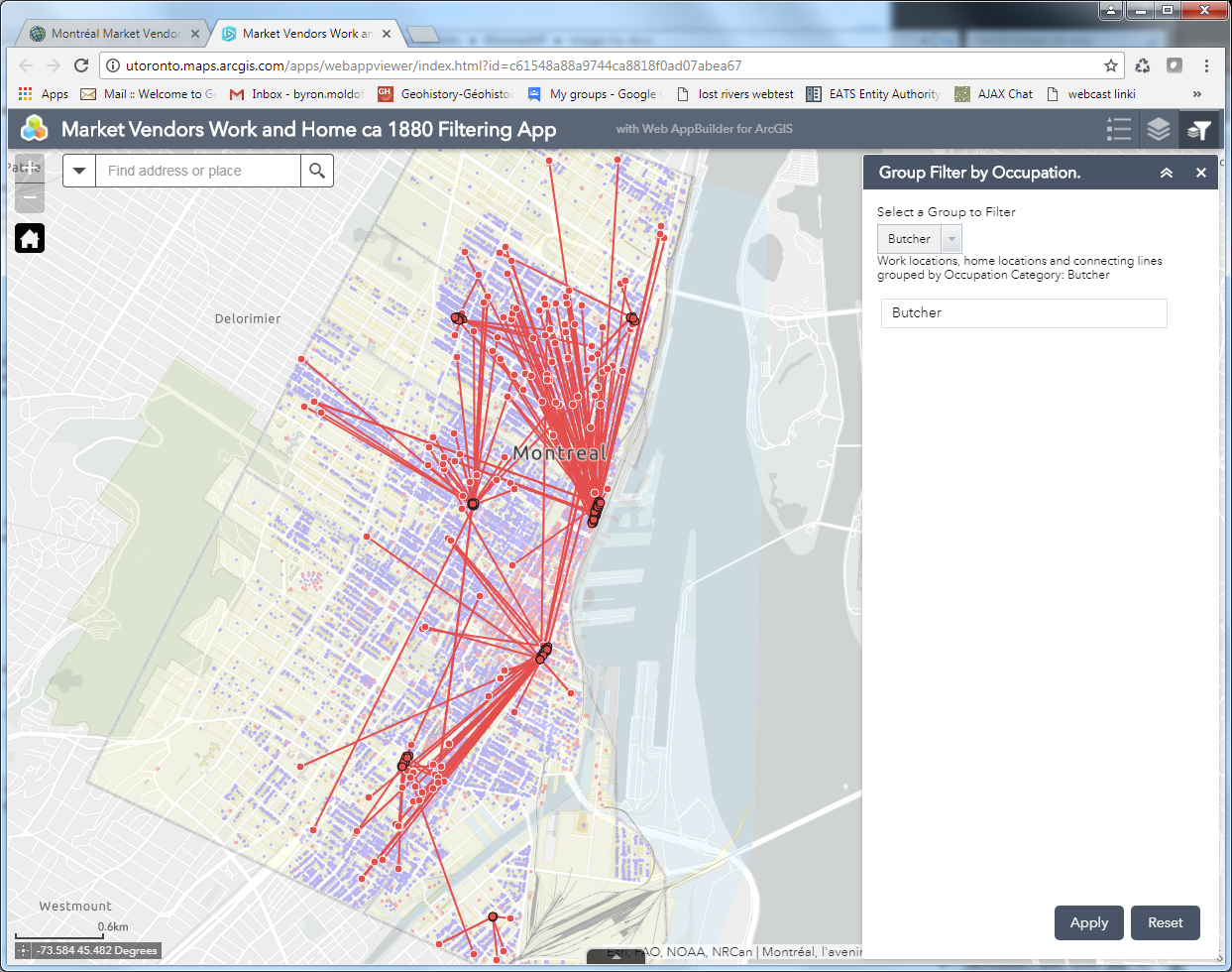
So this is what we attempted to do, first using the Open Source Carto tools, and then using ArcGIS Online. The resultant web maps illustration vendors’ work and home sites look remarkably similar (as one would hope!) Quick default views of these are pictured below: the Carto map showing all of the occupational categories, the ArcGIS Online map showing the symbols and lines just for “Butchers” in the markets.
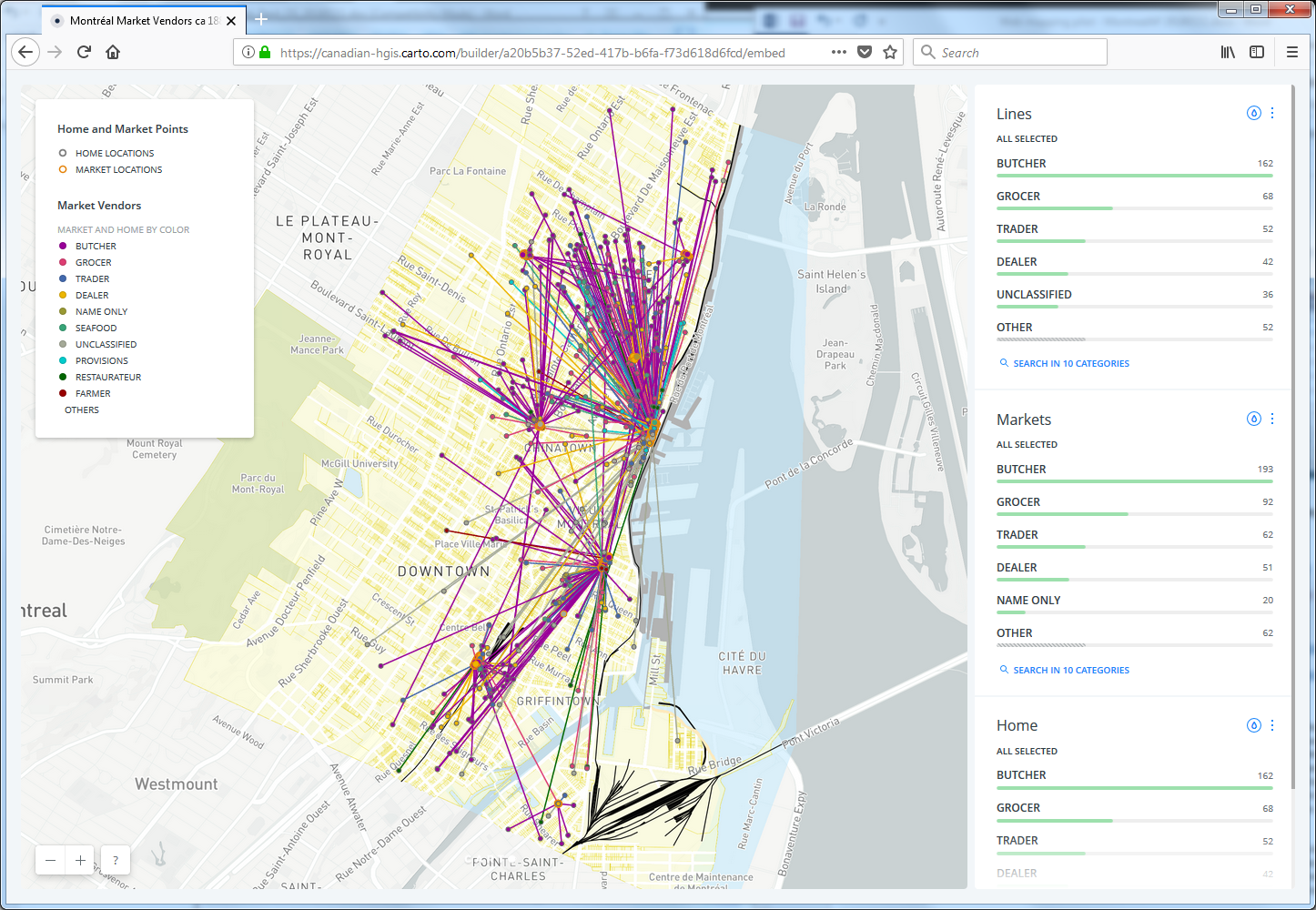
Carto user view showing ALL vendors and connections
ArcGIS Online App filtered to show points and connections only for "Butchers"
ArcGIS Online App filtered to show points and connections only for “Butchers”

A side note: Unlike our other pilot projects, which focus on functionality and customization of coding for map design and presentation, this project is primarily about enabling the user to analyse and explore data interactively. Therefore rather than a breakdown of the code required to produce a final web-map, our detailed documentation consists of the step by step process for using the latest online tools from Carto.com and ArcGIS Online (as of mid-2017) to achieve the objectives of the exercise.

There are similarities, and there are differences, in how the two toolsets approach the tasks at hand, and the final products are certainly distinct. More similarities than differences exist though – which often prompts an intriguing conversation many of in online mapping have had: who’s following whom? No space to explore that question here, but feel free to post your own comments below.

Some of the similarities are superficial. For instance, the tools to achieve these products are fairly recent additions to their online toolboxes. Both software suites number these among what they both call “Analysis” tools. Their menu-driven editing interfaces look similar, as pictured below. Carto uses an Carto Builder “Analysis” tool called “Connect with Lines”, to create connections between point locations. ArcGIS Online uses an “Analysis” tool named “Connect Origins and Destinations”, to achieve a similar outcome. However, the AGOL tool is actually built to do network analysis and routing, and has much more sophisticated potential applications, whereas the Carto tool is limited to making straight line connections between points.
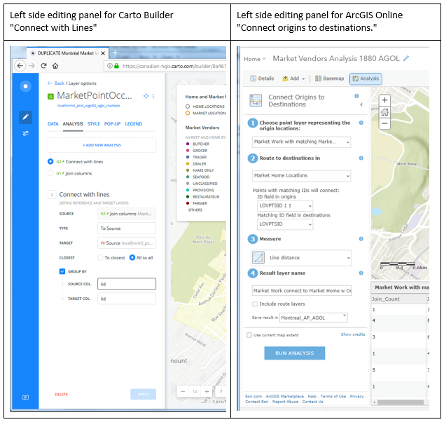
Table Connect with lines AGOL and Carto

Despite the relative limitations of the Carto tool, it does achieve the outcome required by this project – and the flip side of its simplicity is that it proved to be easier to use, and much more forgiving in terms of its data requirements than the AGOL tool. For example, the Lovell Montréal data set of work and home locations turned out to have many more work locations than homes – not all market workplaces had identifiable matching home locations. And some market workplaces had many more than one “home” location associated with them. The Carto tool sailed through these discrepancies, and drew lines between all the matching points without any issues. The AGOL tool on the other hand, popped up the following error messages, in turn:

AGOL O-D error message table
ArcGIS Online error messages for Origins-Destination

So in order to make the AGOL Origin-Destination tool work for our purposes, some significant data manipulation had to be completed – this is all described in the detailed documentation for those who are interested.

This is NOT to say that obliviousness to data discrepancies is always a virtue – trouble-shooting the data issues for the AGOL tool provided a much better understanding of which work points were actually connecting to which home points. Rather, it is just to say that, as usual, one must make sure that for any analytical task, the right tool for the job is identified and used.

In my estimation, both AGOL and Carto now provide the interactive online tools to map the data, and to allow the analysis for at least this specific scenario, that Robert Sweeny had desired for his students and other users of the Montréal, l’avenir du passé project data. However the question remains: is this an effective environment for doing this kind of work? GIS and other software providers are putting more and more functionality into browser-based “software as a service”, delivered online. The advantages are clear: any browsing device can access these GIS tools, nothing has to be installed locally, resulting in much broader access for users. The disadvantages: limitations in processing tools, limitations in interface and symbol design, and limitations in number of views allowed without paying fees. The question of what is best for any set of students or other users, requires a balancing of these issues.

Please feel free to post comments discussing these pilot projects using the space below.

For more detailed information about the work done on these pilot project web maps, we have mounted our technical development documents on this site, linked below.

LINKS TO DOCUMENTATION

Montréal Market Vendors ca 1880 Open-Source Development Document

Montréal Market Vendors ca 1880 ArcGIS Online Development Document
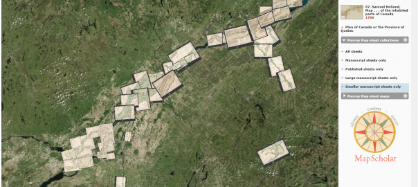
Using MapScholar.org to visualize maps in the Murray collection

Using Mapscholar.org to put the Murray Maps of Canada ca 1761 online

Guest post by S. Max Edelson, University of Virginia

This semester, I’m leading a group of University of Virginia undergraduates in a collaborative, project-based digital humanities course to put the Murray Map of Canada online in a dynamic digital exhibition. Taught as a selective Pavilion Seminar, this “Digital Practicum in Map History” is a hands-on experience that combines traditional reading, writing, and discussion with a workshop in digital humanities development. It involves an interdisciplinary focus on the history of cartography, visual design, digital humanities, public history, and the global history of empire.

As librarians scan the contents of their map archives, preserving fragile artifacts by creating high-resolution images, new tools are being developed to present these vital historic objects to a broad public audience. One of those tools is MapScholar, a distributed, browser-based visualization authoring tool purposed-built for illustrating scholarship in the history of cartography. With support from the ACLS and the NEH, research scientist Bill Ferster and I built MapScholar at University of Virginia’s SHANTI (Sciences, Humanities, and Arts Network of Technological Initiatives). My primary goal was to build a dynamic platform to display some 300 maps that are the subject of my forthcoming book, The New Map of Empire: How Britain Imagined America before Independence (Harvard University Press, 2017). Among the many maps I examined for this research, I was intrigued by the Murray Map collection at the William H. Clements Library at the University of Michigan. This huge manuscript collection–copies of which are also held by the British Library and the Library and Archives of Canada–seemed an idea source to mount and view online, bringing all of its disparate pieces together through georeferencing to fully appreciate the scope and ambition of this eighteenth-century surveying and mapping project.

When British forces occupied New France in 1760, the territory’s military governor, General James Murray, initiated a comprehensive survey of what would become, after the formal cession in 1763, the British colony of Quebec. The impulse to map Quebec came from military rather than administrative designs. Murray expected the province to be handed back to France after the peace had been negotiated, and he wanted to gather strategic intelligence that might be useful in support of a future invasion. As Murray explained to William Pitt in 1762, with this survey in hand to reveal the intricate passages along the waterways of the St. Lawrence River valley, Britain “never again can be at a loss how to attack and conquer this country in one campaign.” Murray dispatched eight army engineers to lead surveys along different sections of the river. The composite map they produced contained seventy-four separately mapped sections that, when joined together, formed an interconnected image forty-five feet long and thirty-six feet tall. Representing space at the scale of two thousand feet to one inch, these maps were among the highest resolution topographic maps produced by eighteenth-century surveyors anywhere. The Murray maps’ design as a strategic profile of the province was made clear by the addition of demographic summaries that enumerated how many men capable of bearing arms lived in each district.

Map curators Brian Dunnigan and Mary Pedley at The William L. Clements Library at the University of Michigan provided high-resolution scans of the Murray Map and have met with the class via video conference to help us develop it. As students georeference maps, design dynamic visualizations, record object metadata, manage distributed web resources, and write essays and annotations that provide context and interpretation, they will gain first-hand experience in digital humanities work.

We are beginning to georeference the collection now, and I will provide updates about our progress in a future blog post.

S. Max Edelson is an Associate Professor at the University of Virginia in the Corcoran Department of History.

Map Your History! Building and Sharing a Historical Spatial Data Infrastructure with the Keweenaw Time Traveler Project

While Historical GIS (HGIS) has become a familiar approach in the social sciences and humanities (Gregory and Geddes, 2014), recent trends in the social science use of GIS have called for HGIS implementations that can apply Big Data-based HGIS approaches to more qualitative research questions and, perhaps most importantly, more closely involve the public. Approaches range from allowing users to contribute to HGIS research using improved web interfaces, such as the New York Public Library’s Building Inspector, to the expansion of qualitative HGIS research (Olson, 2011; Lafreniere and Gilliland, 2015). In the broader world of GIScience, researchers have developed hybrid qualitative/quantitative tool combinations that expand the research potential of GIS further still (Kwan and Ding, 2008; Jung and Ellwood, 2010); these have more recently become topics of interest in the HGIS community as well. As part of this trend, Michigan Technological University’s Historic Environments Spatial Analytics Lab (HESAL) is preparing to launch the Keweenaw Time Traveler project – combining the latest generation of historical spatial data infrastructure with Web 2.0 technology and public outreach in ways that foster closer connections between research and the public by making history both fun and accessible.

Our Subject in a Nutshell: The Copper Country

The Keweenaw Time Traveler Project (KeTT) brings to the public a regional HGIS focusing on the Copper Country of upper Michigan, a region of the Midwest USA that contains the world’s largest deposits of nearly pure elemental, or native, copper. Native Americans exploited this resource for thousands of years; a subsequent industrial copper boom in the mid 19th century led to the area becoming the world’s largest supplier of copper by the 1880s, with a rapidly growing population and massive mining infrastructure quickly built in what had been a remote, if beautiful, wilderness. By the end of WW I, economic factors coupled with the growing cost of extraction led to a long, slow decline in the Copper Country’s mining economy, ending with the closure of the last mines at the end of the 1960s. When mining activity ceased, the entire region became a vast industrial archaeology site, a relict landscape. Today, with the population a fraction of its historical peak, the Copper Country’s economic base has largely shifted to service and tourism; local identity remains closely tied to Keweenaw’s mining heritage, however, and the area attracts visitors as much for its mining history as for its natural beauty.

www.mapyourhistory.org

Building the Foundation of the KeTT: Datasets and the
CC-HSDI

The Keweenaw Time Traveler benefits from the richness of historical data found within its geographic area of focus. The largest historical copper mining companies in the region, such as the Calumet & Hecla and Quincy mining companies, were among the great industrial giants of their day; the scale of their enterprise required a vast industrial infrastructure along with company towns to house their workers, all of which had to be designed, built, and paid for. As a result, most of the towns and large mining locations in the Copper Country are extraordinarily well-documented in the form of an extensive body of Sanborn fire insurance plans (FIPs), company-produced maps with detail that even surpasses FIPs, plan drawings and blueprints. In an age of corporate paternalism and scientific management practices, mining companies also extensively documented the lives of their workers and their families; the KeTT team has begun the digitization of an unprecedented wealth of detailed records on company housing, employee records and health records that provide far more information than standard census data. These are combined with decennial census data from the Minnesota Population Center, business and phone directories, and school records to provide a uniquely detailed look at the history of an entire region down to the level of the individual over the course of a century.

The core of the project is the Copper Country Historical Spatial Data Infrastructure (CC-HSDI), a next-generation implementation of HGIS designed to better facilitate both quantitative and qualitative research, while also fostering public engagement with both local history and the concept of HGIS itself. Using ArcGIS Desktop, ArcGIS Server and a PostgreSQL geospatial database, the CC-HSDI contains a series of ESRI Map Services consisting of georeferenced maps or FIPs broken into a series of time slices roughly equating with census years (in addition to smaller collections of maps from other years). Building these map service presented an early challenge to the KeTT team, as the size of each map service (representing a single town in a single year) ran into the tens of gigabytes and required the establishment of a dedicated PostreSQL geospatial-enabled server at Michigan Tech. Subsequent expansion of the HSDI will require these services to migrate to an off-premises enterprise-scale server facility (Amazon AWS) in the near future.

The historical built environment of each time slice in the CC-HSDI is then hand-digitized from the map services, resulting in over a hundred thousand building footprint polygons (as well as roads, rail lines and a few other infrastructural components). These polygon shapfiles serve as the geographical anchor point for all of the CC-HSDI’s non-map-based historical data mentioned previously and constitutes the “built environment stage” of the HSDI (after Lafreniere and Gilliland, 2015). This stage not only includes the building footprint itself, but other relevant data transcribed from the FIPs including the spatial arrangement,  street address,  and number of stories for each building.

Linked to the built environment stage geodatabases are non-map sources including data from the nearest census, business directories, phone directories, and company and school records. These records capture the social environment of each time slice in incredible detail, including whether a primary school student was immunized, or the medical profile of mining company employees. Coupled with the census data and business directory data that are already staples of HGIS, this “social environment stage” (after Lafreniere and Gilliland, 2015) not only represents a step forward in the ability of HGIS to contribute to qualitative research on past social environments, but provides the public with a wealth of local information that fosters a personal connection with the HGIS.

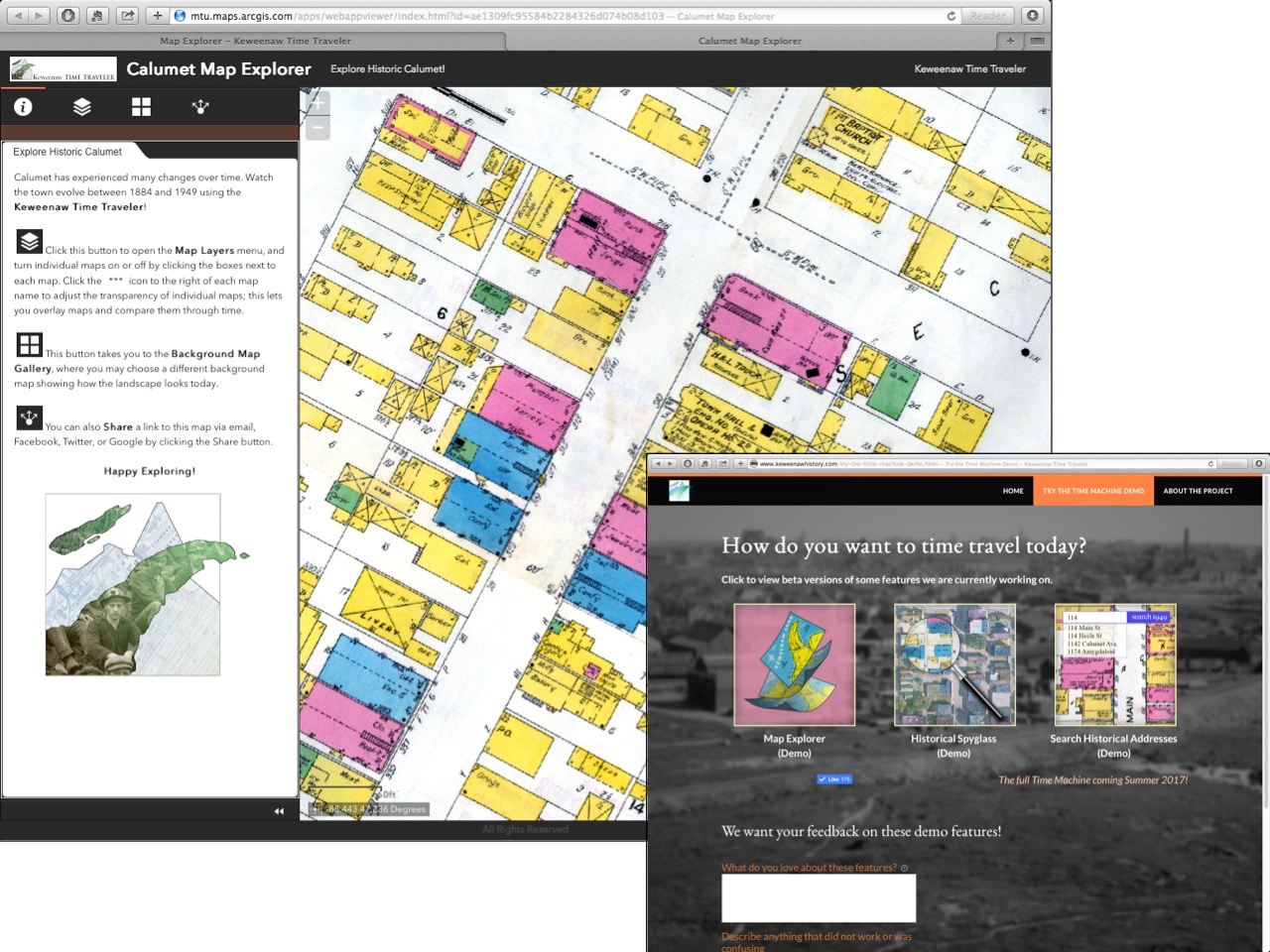
The KeTT prototype web apps, developed in ArcGIS Online Web AppBuilder, allowed the team to gain valuable experience in developing requirements for the forthcoming full public launch of the KeTT Project.

Public Outreach and Collaboration: The Keweenaw Time Traveler

While the Copper Country HSDI is an invaluable research tool in its own right, The KeTT project serves to connect the public with a new way of viewing their past environments.  This is accomplished through the use of web apps. Each app represents a different way of exploring and/or contributing to the HGIS. The KeTT is currently developing four different web apps that allow the public to interact with and contribute to the HSDI. These web apps provide the user with tasks ranging from basic historical map interaction exercises to facilitating more complex storytelling:

  • Recording the built environment by building material (using the fire insurance plan color-codes)
  • Identifying and recording the broad use-type of a structure (dwelling, commercial, institutional etc.)
  • Transcribing descriptive map text for individual buildings
  • Contributing personal stories and recollections about specific places on historic maps

Initially, the team used ArcGIS Online’s Web Appbuilder to build and test these apps for the KeTT. ArcGIS Online apps are an excellent resource for HGIS researchers looking to share data with the public; researchers with little or no programming background can quickly convert GIS data into customizable, publicly accessible web apps that take advantage of ArcGIS Online’s robust back-end infrastructure. However, large raster datasets can become expensive to share this way, as are the implementation of geospatial analysis tools, which consume ESRI credits. After building several prototypes, the KeTT team also realized they wanted more control over the app interfaces and underlying programming logic than the Web AppBuilder provided. This meant hiring a programmer and developing custom web apps in Javascript that made use of the CC-HSDI’s ESRI map and feature services. Despite this, ArcGIS Online’s Web App Builder proved to be invaluable for creating app prototypes and allowing the team to develop a clearer ideas about the look and feel of the final web apps.

GRACE project

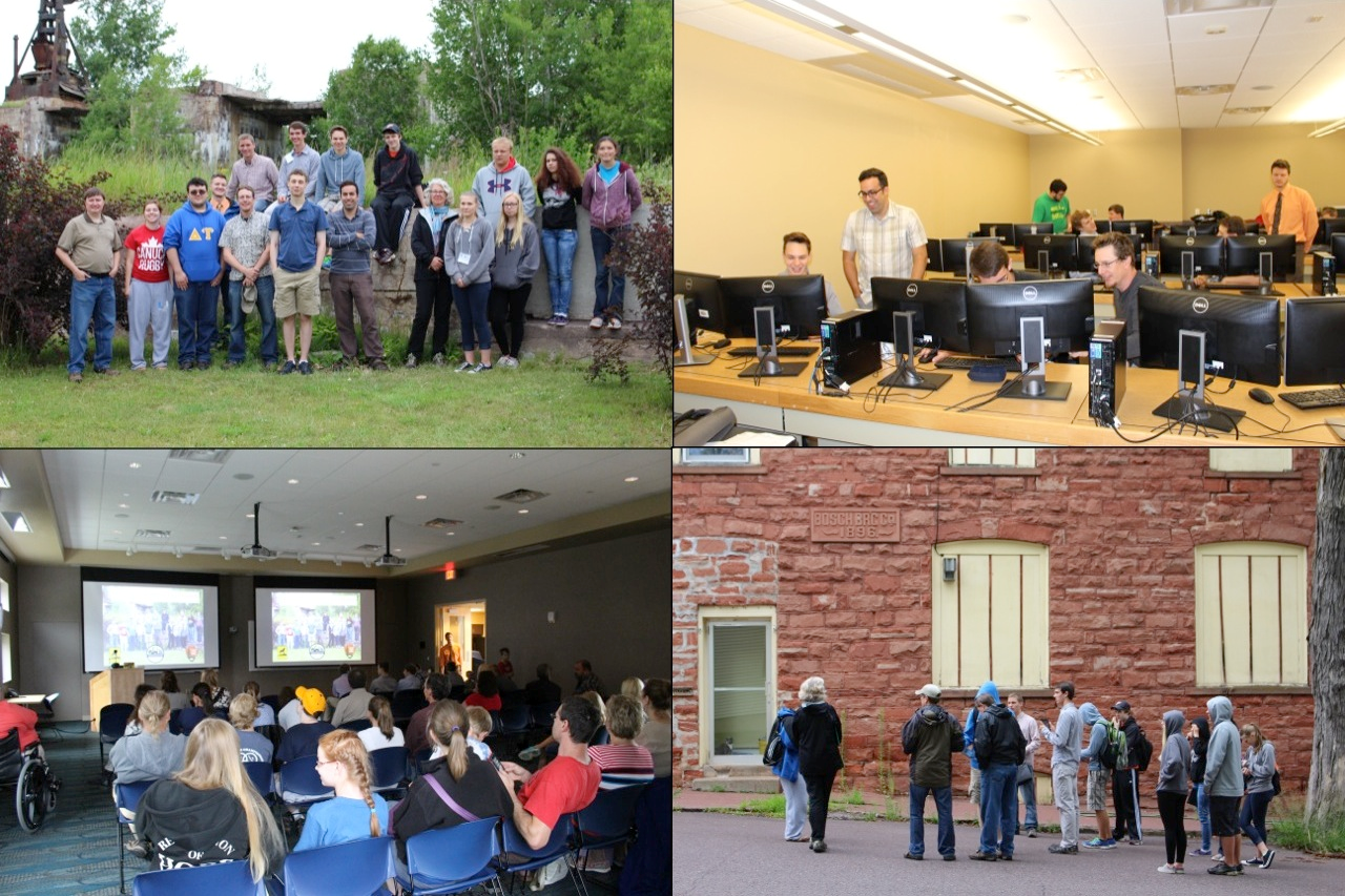
The KeTT project has emphasized public outreach and involvement as an integral part of the construction of the HGIS, not just its dissemination or end use. The team has reached out in several ways to accomplish this. Last summer’s GRACE program served as an early example of what the KeTT project could achieve. The G.R.A.C.E. Project — (GIS Resources and Applications for Career Education project) is a NSF funded collaboration between Dr. Yichun Xie, PhD, Professor/Director at Eastern Michigan University’s Institute of Geospatial Research and Education, Dr. Don Lafreniere at MTU’s HESAL, Michigan’s Virtual University, and several statewide professional GIS organizations to provide hands-on training in the use of GIS to students and teachers in economically disadvantaged communities.  Last summer, the GRACE project partnered with the Keweenaw National Historic Park to bring GRACE to the Copper Country. Interns recruited from local high schools joined the HESAL at MTU in Houghton, Michigan to digitize major portions of the KeTT’s built environment stage from Sanborn fire insurance plans. During the course of the internship, GRACE students not only learned resume-building GIS skills, but also explored the history of their local community at a level of detail few people have access to. At the end of the internship, interns used ArcGIS Online StoryMaps to share portions of their local history they found most interesting during their work with members of the public. The KeTT team found the GRACE project to be a great way to involve the local community in ways that provided real benefit, and to generate some publicity in the process.

The GRACE project took high school students into the lab and field, helping to build the Copper Country HSDI while also using it to explore the historical built environment of their local community and, ultimately, to share their experiences through public presentations.

Next Steps

While a lot has been accomplished thus far, The KeTT project is just warming up; we plan to “go live” this spring, replacing the current beta web apps on the project website with the final, custom-programmed web apps that allow the public to explore, interact with, and contribute to the Keweenaw Time Traveler. The release of the final apps will coincide with a new season of KeTT team outreach activities in partnership with Keweenaw National Historic Park and Keweenaw Heritage Sites to spread awareness of the project and provide public outreach. In addition to the ongoing GRACE project, we will be bringing custom-built touchscreen kiosks to numerous public events around the Keweenaw that allow people to use the KeTT web apps with the help of KeTT team members and partners. Stay tuned at www.mapyourhistory.org!

References

Gregory, I. N., & Geddes, A. (2014). Toward spatial humanities: Historical GIS and spatial history. Bloomington: Indiana University Press.

Jung, J.-K., & Elwood, S. (2010). Extending the Qualitative Capabilities of GIS: Computer-Aided Qualitative GIS. Transactions in GIS, 14, 1, 63-87.

Kwan, M.-P., & Ding, G. (2008). Geo-Narrative: Extending Geographic Information Systems for Narrative Analysis in Qualitative and Mixed-Method Research. The Professional Geographer, 60, 4, 443-465.

Lafreniere, D., & Gilliland, J. (2015). “All the World’s a Stage”: A GIS Framework for Recreating Personal Time-Space from Qualitative and Quantitative Sources. Transactions in GIS, 19, 2, 225-246.

Olson, S., & Thornton, P. A. (2011). Peopling the North American city: Montreal 1840-1900. Montreal: McGill-Queen’s University Press.


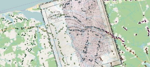
Detail of a georeferenced historical map and the combined digitized house locations from the 1880 Historical Atlas of PEI. Each student digitized a different township, symbolized here by the different colours.

Teaching Historical GIS and Restoring Lost Communities in the Classroom

This article is a cross-post from The Otter ~ la loutre, and is part of a series on using historical Geographic Information Systems (GIS) for teaching and research in environmental history and historical geography. It is part of a collaboration between the Network in Canadian History and Environment (NiCHE) and the Canadian Historical GIS Partnership Development project. Other articles in the series are available here. If you would like to contribute a post to the series please contact the editors Josh MacFadyen or Jennifer Bonnell.

Canadians have been hitting above their weight in the area of geospatial analysis since the development of the Canada Land Inventory and the world’s first Geographic Information System (GIS) in the 1960s and 1970s. Similarly, environmental historians and historical geographers have made great gains in Historical Geographic Information Systems (HGIS) research over the last decade, including several NiCHE projects, a 2014 edited collection, and now the Canadian HGIS Partnership. Canada is big. And in typical high modernist fashion, postwar scientists trying to fathom it ignored the knowledge of the rural, northern, and indigenous people who understood its land and water. Instead scientists turned to digital tools like GIS to examine and measure the nation. In what we believe is a post-normal and integrative approach, environmental historians are now both using the software and critiquing the normative processes it helped to create. But Canada is still big; its libraries, students, and other knowledge resources are very far afield. Our communities of digital scholars employ digital tools to collaborate and communicate our results across the continent. This post focuses on the students using these tools and the new ways historians are teaching HGIS online. This kicks off a series written by NiCHE and CHGIS collaborators on geospatial tools and analysis for Canadian historians.

Click here to go to complete article on Niche site…